

My shot of the Old Man of Storr (the black and white one) I titled 'So you think I should have just kept on driving?' because I was very aware of how cliched the shot was when I uploaded it to my flickr account. I felt the same about this shot I took standing at the Old Man of Storr:


Billy's shot is far superior to mine so why did I bother posting my effort? Well, I feel by taking the shot and making a decent effort, and then comparing it to others I can learn and improve by considering what my shot didn't have that a better picture did. (Let's not forget the basic function of letting friends and family see some of my holiday snaps!)
Now, here's the thing, I hadn't seen his shot before taking mine. In fact, I can honestly say that I never consciously studied any picture of the scene before going there to take it. I ended up at that spot because the well worn path led me there!
Nineteenth century photographers shot the same scene over and over again for financial reasons (people would buy prints of popular places and landmarks) and it was expected of you if you wanted to be known as a travel/landscape photographer. There was a high demand for these popular scenes and photography was a business so they satisfied a demand and flooded the market with views of foreign lands and stunning natural and man-made monuments.
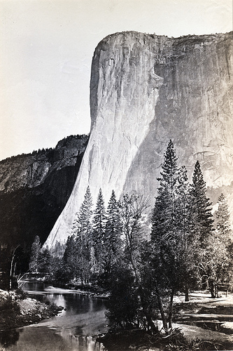
I then wondered how competitive this market was. These early Victorian photographers were exploring and venturing into wilderness and if you found a stunning view, positioned yourself to capture it effectively you could make a bit of money with such a print. Consider then how annoying it must have been to have someone follow in your footsteps and find the exact same point. El Capitan in Yosemite by Carleton Watkins:

You don't have to be any kind of expert to see why some photographs of exactly the same spot can be more pleasing to the eye than others. In today's competitive, saturated market how can a landscape photograph stand out? Removing the subject matter in a landscape photograph (because in this scenario it is the same), what choices do photographers make to help them create a 'different' shot of the same scene?
- Time of day, time of year and quality of light. Weather conditions also.
- Your point of view. Are you going to stand exactly where everybody else stands?
- Your field of view. What will you include/exclude?
- Horizontal or Vertical?
- Lens choice - will either pull the subject closer or push it farther away (unless using a standard lens).
- Camera choice, medium choice, camera settings.
- People/objects included or not.
Here's a question for you - if you were to include something personal to a classic view, let's say for example a red chair in the classic Glencoe shot and then somebody went back to the exact same spot with a yellow chair, took a shot, is that plagiarism? Or is it flattery?
On a similar theme take a look at the work of Klett & Wolff

Thanks again to Jeff Curto's History of Photography. This blog was inspired by his Spring 2011 Class 7.
No comments:
Post a Comment